I’ve been studying the copy of the Philosophical Transactions at he University of Chicago Library Hanna Holborn Gray Special Collections Research Center on a Robert L. Platzman Memorial Fellowship.
Last week I had posted a puzzle: Which of two corrections was from the printer’s shop? And which was from someone reading the book as bound? Take a look if you haven’t, since I’m going to talk about the one from the printer’s shop here.
⁂
Carly Yingst and James Wallmann both figured it out right away. James Wallmann didn’t need the hints as he noted the marginal note. Why would a reader make a marginal note?
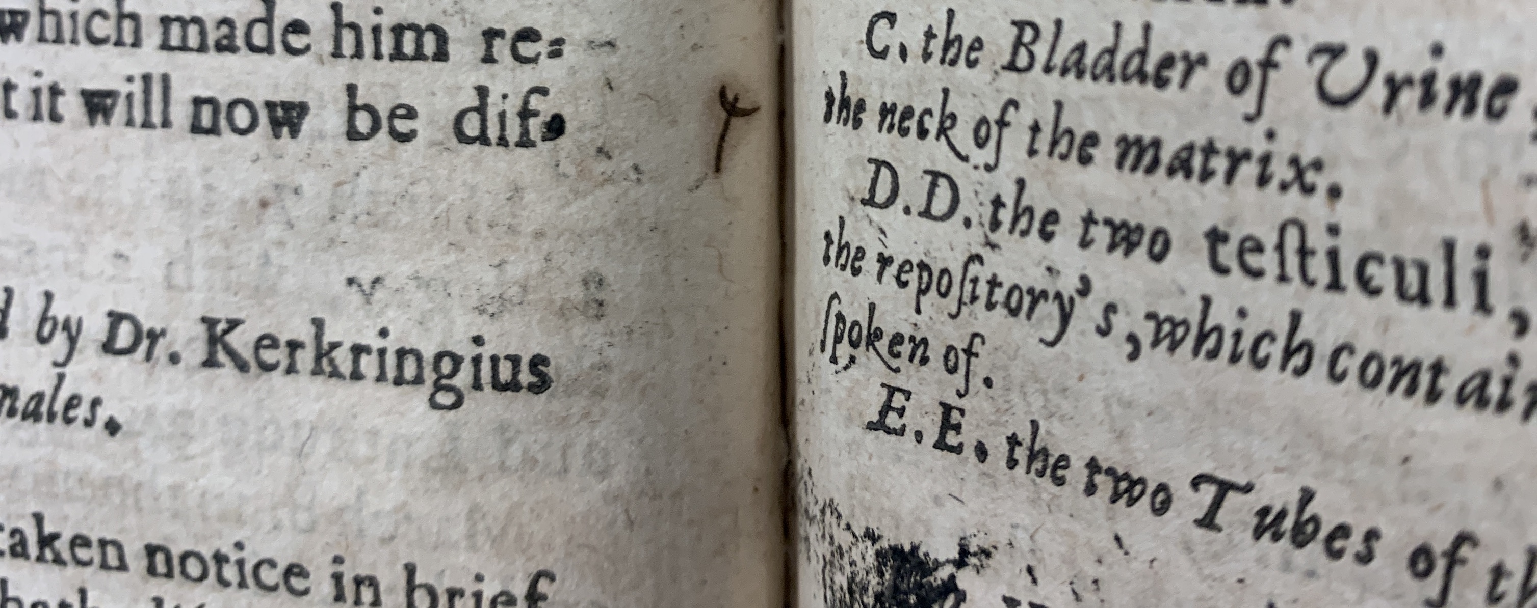
Carly Yingst noted the marginal notes too, but they also asked about the inner margins around the w correction on the opposite page. The beginning of “withall” was underlined.
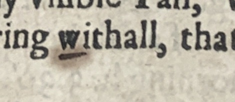
And in the margin was this unusual mark you see at the top of this webpage. They didn’t recognize the mark from contemporary proof-reading and neither did I.
What is this mark?
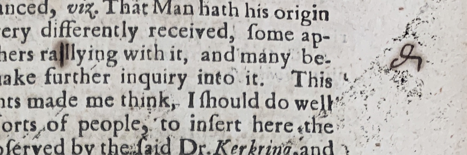
The two other marks have a similar form. Below is a deletion, with a vertical line through the letter to be deleted and the dele mark in the margin.
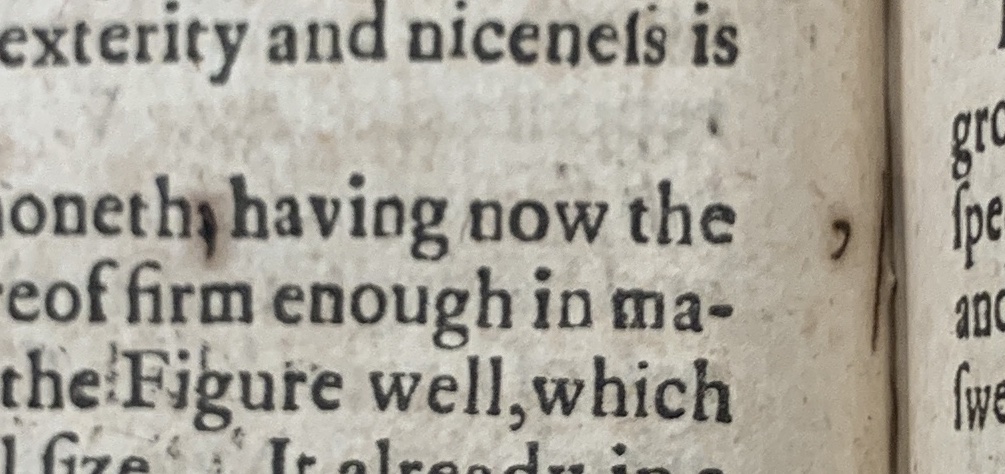
The second of the two other marks indicates a substitution. A period had been set where a comma was called for, so the period was marked through and a vertical line was drawn in the margin preceded by a comma. The vertical line is a little hard to see because it is now in the gutter. (Note: the impossibility of making this mark in the bound book is more evidence that this was done while the book was in sheets.)
The marginal proofreader’s marks accompanying in-text marks serve two functions: First, they make it easier to spot where corrections have been made. Second, when a compositor has a proof in hand they can follow the marginal marks to collect the necessary pieces of type without having to re-read the text. They can just go down the page and grab every letter they see that they need, put those letters in their stick, and carry them to the imposing stone. At the stone they would prick out the incorrect type and insert the correct type.
The marginal marks with vertical lines generally indicate what type needs to be grabbed to make the page right. The seventeenth-century marks for capitalization, italics, black letter, and roman founts also use a vertical line to indicate that new type would be needed. Moxon explains in volume two, page 264 of the linked edition.:
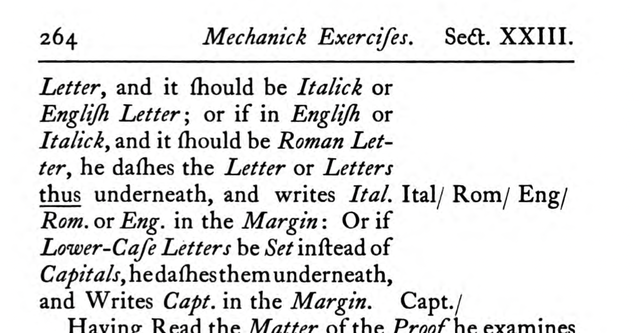
When I look at the mystery mark, it looks to me like a kind of vertical line proofreader’s mark like the above. In Moxon’s list, the vertical line with an underline in the text indicates a change of fount. So my best guess here is that the proofreader wanted “withall” italic or capitalized, but part way writing they changed their mind. The casually curved cross-beam of the mystery mark could indicate that the mark should be ignored. It seems like a marking out of the mark itself.
Writing “stet”, let it stand in Latin, would be typical of our time. But Moxon does not mention this abbreviation. The earliest citation seems to be Smith’s Printers’ Grammar of 1755, but he uses stet narrowly:
Where words are struck out that are afterwards again approved of, they mark dots under such words, and write in the Margin, Stet.
This represents a different sort of mind changing: from deleting a word to letting it stand. The mind changing I propose is from changing the typeface to leaving it in roman; it would be standing either way.
To be clear, I’ve never seen a mark like the mystery mark, so I’m just guessing. I’d love to know if you have more insight.
The spread
Carly Yingst and I were discussing the spread of the sheet. I thought it would be fun to assemble what the inner and outer form must have looked like. The inner forme has no corrections and is relatively clean.
The outer forme has the corrections I mention above and the inky marks. Notice too that there’s a slightly mirrored set of marks on the middle right margin and a diagonal mark across the upper-left page.
Since the compositor carried proofs around the shop, I suspect the mirrored marks on the right come from them folding the page in half so it was less unwieldy. You can see similar marks on the left of the inner forme’s sheet, which is the same place because you flip the sheet over to get the other side.
The diagonal mark really excites me. It looks to me like a piece of furniture from the forme. The compositor could have taken this sheet of corrections, grabbed the necessary type at the case, then brought the new type and the corrected sheet to the forme on the imposing stone. They would have then unlocked the form, perhaps setting the piece of removed furniture on the sheet. The heavily inked thumb print, perhaps, shows them picking the piece up again to reinsert it.
Optically collating the sheet against the final version using PocketHinman confirms that only these two changes were made. So we probably have the final proof sheet used to print this with the last corrections. Moxon call the last trial proof a revise and distinguishes it from the earlier proofs. A revise would be checked by the printer’s corrector, not the compositor themselves.